Best Beaver Builder Elements
There are many Beaver Builder elements to choose from and listed below are just some of the most common modules we use and a small gallery of instances where we have used them. They are generally the most common because they are the best or most versatile plugins. To view all of the available plugins on beaver builder and to see an example of how they can be used please click the button below.
Info Box
This should be your go-to beaver builder module. It is the most versatile beaver builder module as it has so many customizable options. The same module can look completely different depending on what you choose to do with it.
Some of the features of the info box include:
- Sections for title, text and even a title prefix
- You can have either an image or an icon - each can be customised in many different ways. This module even gives you the option to crop the image to a particular shape e.g. square, circle etc.
- Separator - a few different option for the style of the line, choose the colour, thickness, width etc
- Background colours with the option to change them on hover
- Link options include linking the whole box or you can add a button. You can also add icons to the button.
- You have full control over the margins between everything in the info box - IMPORTANT - By default the title is given a 10px bottom margin. This is fine unless you add a separator as the separator has a default of 20px top and bottom so you will end up with 30px above the separator if you do not remove the 10px from below title. So please remember to leave even margins if you add a separator to the info box as you will be asked to change it.
- Typography - full control
When Not To Use An Info Box
- If you want a drop shadow on an image - You will not be able to add a drop shadow to the image in an info box but you can with the photo module so you should still use the infobox for your text but use the photo module for the image and place it above/beside the info box.
- If you want a fancy separator e.g. one with an icon, image or text in the centre. This is only achievable with the heading module (advanced one) - You can also add a description in the heading module
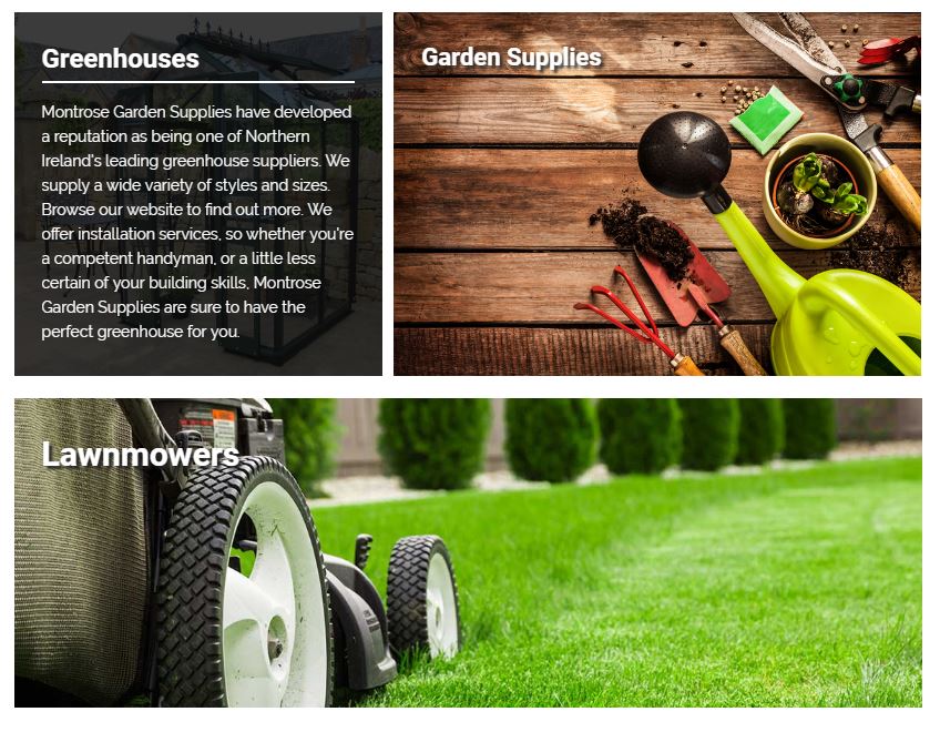
Info Boxes In Use


Heading (from the advanced section of modules)
This module is great for adding a little more detail to your designs. This module will allow you to add a separator as either a plain line (you can customise the style of the line), line with an icon, line with an image or even a line with the text. This can add more detail to your design. You also have the option of adding a description.
When Not To Use A Heading
- If you want a button - There is a button module which you could use to add where you want and get the same result but you cannot add one to a heading module
- If you would like an icon/image above or below the heading etc. - The icons and images are only an option within the separator.
Heading Modules In Use


Info List
This module is great for listing services etc. You can have a title, description and an icon or image. Here are just some of the things possible with an info list:
- The images can be cropped to different shapes, helping with uniformity and set to your preferred width
- The icons can be laid out horizontally or vertically and are totally customisable
- It is possible to show a line connecting each link and this line is also customisable
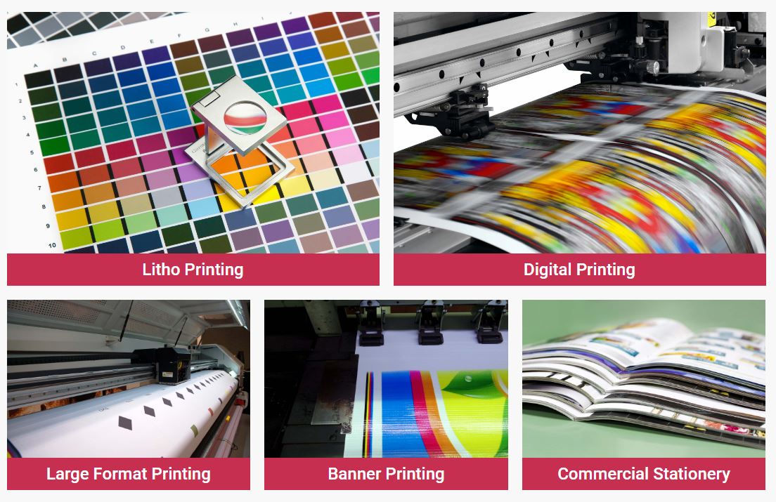
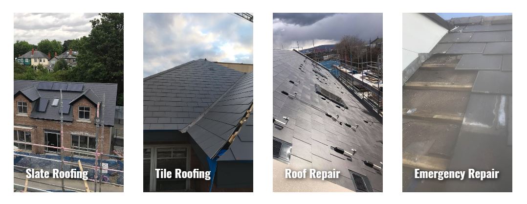
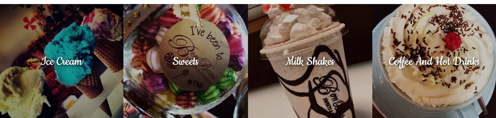
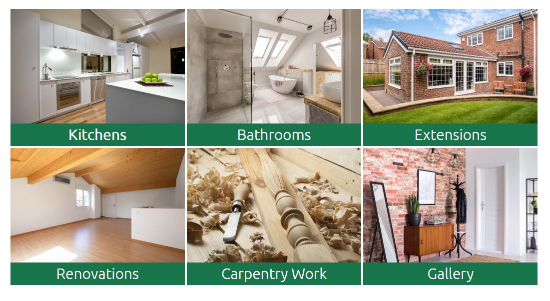
Info List In Use


Interactive Banners 1 & 2
This is a great module for displaying the services of the company as you can add links to either the whole banner or a button within the banner. There are many different styles you can choose from and many customisable options. You can change colours and opacity on hover, add buttons.
The interactive banner 1 & 2 are quite similar in that they both have an image title, information on hover and links, however, the interactive banner 2 has more style options and is seen as a more creative module but is not as customisable as the interactive banner 1. The advantage of the interactive banner 1 is that you can put a background colour on the title and choose how to align it as well as add icons.
Each module has its advantages and disadvantages and no 1 is better than the other so, which one you choose, completely depends on what suits that particular design.
Important: If you intend on using more than one of these you must crop the images in photoshop to be the same size as it is not possible from within the module and you will end up with interactive banners of different sizes.
Interactive Banners In Use